If you want to get more therapy clients into your private practice, you need two things:
1. A website that is fully optimized for lead generation
2. Lots of visitors pouring into that optimized website.
Printed flyers, professional networking events, and other marketing efforts all have their place, but in an age when 98% of people turn to the web to find services like mental health therapy, nothing will make a bigger impact on the growth of your therapy business than getting more of those people clicking on your website and converting them into paying clients.
In this comprehensive guide, I’ll show you how to do both.
Below, you’ll learn:
- How to measure the effectiveness of your website and traffic-generating efforts so that you can tell what’s working and what isn’t.
- Quick and easy website optimization hacks to help you get more therapy clients with minimal effort
- Essential strategies for getting more visitors to your website and converting those visitors into qualified leads.
Ready? Let’s get into it.
Leads, Conversions, and Traffic: What Does it All Mean?
If marketing your private practice is new to you, the whole thing can seem a little confusing.
To make things easier, let me explain some of the key concepts you’ll be reading about in this guide:
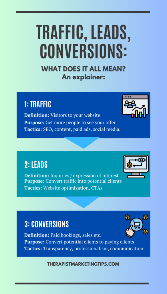
A. Traffic – Visitors to Your Website
Traffic refers to the number of visitors who come to your website.
Imagine your website as a digital storefront, where potential clients can learn about your services, explore your expertise, and decide if you fit their needs. The more visitors you have to this storefront, the more opportunities you have to convert them into paying clients.
B. Leads – Potential Clients
A lead is a potential client who is interested in your services but hasn’t yet fully committed to booking an appointment with you.
A potential client visits your website, reads about your services, and fills out a contact form to inquire further. That person has become a lead, as they have actively indicated their interest in your practice.
C. Conversions – Potential Clients Becoming Paying Clients
Conversions are the ultimate goal of your marketing efforts.
They represent the instances when potential clients, who have become leads, take the final step and become paying clients for your therapy practice. It’s like those who stop by your office, inquire about your services, and ultimately decide to book a therapy session.
How It All Fits Together
When it comes to using digital marketing to get more therapy clients, the process is pretty simple:
First, you generate traffic and get visitors to your site. Then, you get those visitors to become leads and, finally, you convert your leads into clients.
How do you do that?
Let me show you:
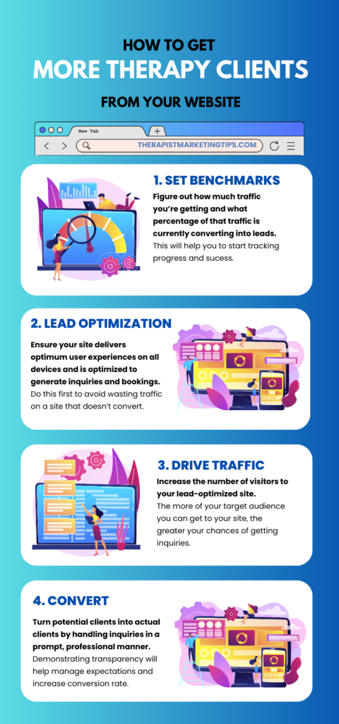
How to Get More Therapy Clients From Your Website: An Easy 4-Step Process
1. Determine Your Benchmarks
Before we go any further, it pays to have a good idea of how much traffic and how many leads and conversions you’re already getting.
These figures will serve as benchmarks against which you can then measure how effective the rest of this process is and track your progress over time.
A. Traffic Benchmarking
To begin, let’s focus on your traffic – How many people are visiting your website?
To work that out, we’re going to use Google Analytics. If you haven’t set up Google Analytics for your website yet, bookmark this page, go set it up, and come back to this guide.
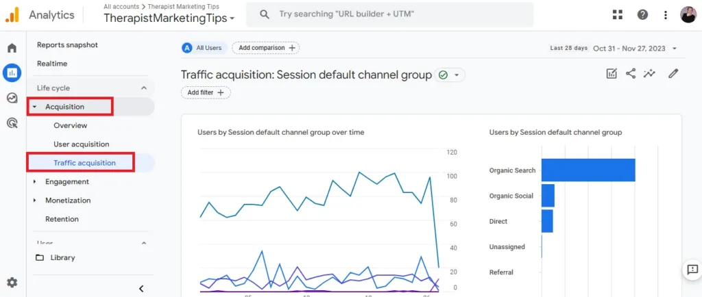
Once you’re set up, first navigate to Aquitision – Traffic Acquisition as illustrated in the image above.
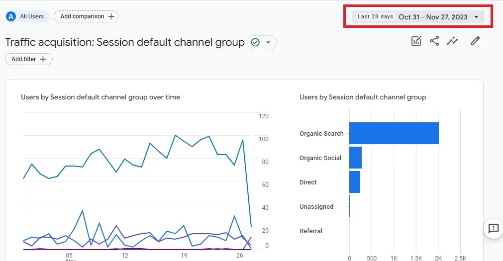
Next, click on the date range at the top and set it to “last 90 days.”
This will give you a better understanding of your website traffic trends over time.
Analyzing traffic from the last 90 days provides a more accurate picture of your website’s performance compared to just looking at the last month’s data.
This is because monthly traffic can fluctuate significantly due to seasonal factors, holidays, or other one-time events. By analyzing a longer period, you can smooth out these fluctuations and get a more reliable picture of your website’s true traffic levels.

From there, look for the “Sessions” metric. A session is essentially a period of time that a user is on your website, starting when they first land on the page and ending after 30 minutes of inactivity.
This metric will show you the total number of times that your website was visited during this period. In the example above, you can see that one of my websites had 11,974 sessions within the last 90 days.
That figure is now my traffic benchmark that I’ll be looking to improve using the rest of this guide.
B. Lead Generation Benchmarking
Next, you want to calculate the percentage of your visitors that are converting into leads.
If the very words “calculate the percentage” fill you with dread, don’t worry, I feel you. Mathematics is not my strong point, but even I find it easy to do this using the following formula:

I. Look at how many inquiries you’ve received from your website in the past 90 days.
To determine the number of leads generated from your website, you can track contact form submissions and telephone inquiries. Ensure that during telephone inquiries, you ask the caller where they found your information. If they mention your website, count it as a lead.
II. Look at the number of sessions recorded on your website during the same time period.
This is the number you wrote down in the traffic benchmarking step.
III. Divide the total number of conversions by the total number of visitors, and multiply that number by 100.
This number, expressed as a percentage, is the lead generation rate for your website.
For example, if you have 1,000 visitors over a three-month period and 10 of those visitors convert into clients, that’s a lead generation rate of 1%.
Measuring your leads as a percentage gives you a more accurate and useful way to measure how effective your website is at generating leads.
If you choose to simply note down the number of leads, that doesn’t take into account the overall volume of website traffic, so it’s harder to tell if any improvements are actually having a positive impact.
For example, let’s say you get 10 leads from your website in a 90-day period. During that same period, you had 100 visitors.
That’s pretty good.
10 leads / 100 visitors x 100 = 10% lead generation rate.
Now, let’s say you measure again after three months and note that you got 15 leads. “Great,” you think. “I’m getting more leads, everything is working well!”
However, what you’ve not considered here, is that by following the steps in this guide, you’ve actually tripled your website traffic, so you’re now getting 300 visitors per month.
Let’s run that through the formula:
15 leads / 300 visitors x 100 = 5%.
In other words, you’ve tripled your website traffic but halved your lead generation rate. So, even though five new leads are good, you’ve probably missed out on many more simply because your website isn’t fully optimized to generate as many new leads as possible.
What is a Good Lead Generation Rate for Therapists?
For the sake of answering this question, I’m going to consider converting a visitor into a lead as a conversion, as this makes it possible to benchmark against available conversion rate data.
Ruler Analytics notes that the average conversion rate across fourteen different industries is 2.9%.

The average conversion rate for B2C (Business to Customer) services, is 2.1%, and the average rate for healthcare is 3.1%.
Since these are the two metrics that most closely align with the work we do as therapists, I’d say that if you’re not already converting between 2% – 3% of your visitors into leads, that’s a good goal to aim for.
If you’re in that ballpark already, you can use the following strategies to get more therapy clients from your website and up that percentage even further.
2. Optimize Your Website for Maximum Lead Generation
Now that you have your benchmarks in place, it’s time to improve on those numbers.
To do this, I want you to focus on your website first. After all, there’s not much point putting all your efforts into driving more traffic to a website that isn’t properly optimized to turn that traffic into leads.
Here’s what to do.
A. Ensure Your Site is Fully Responsive
More than 60% of all organic searches in the United States are carried out on mobile devices.
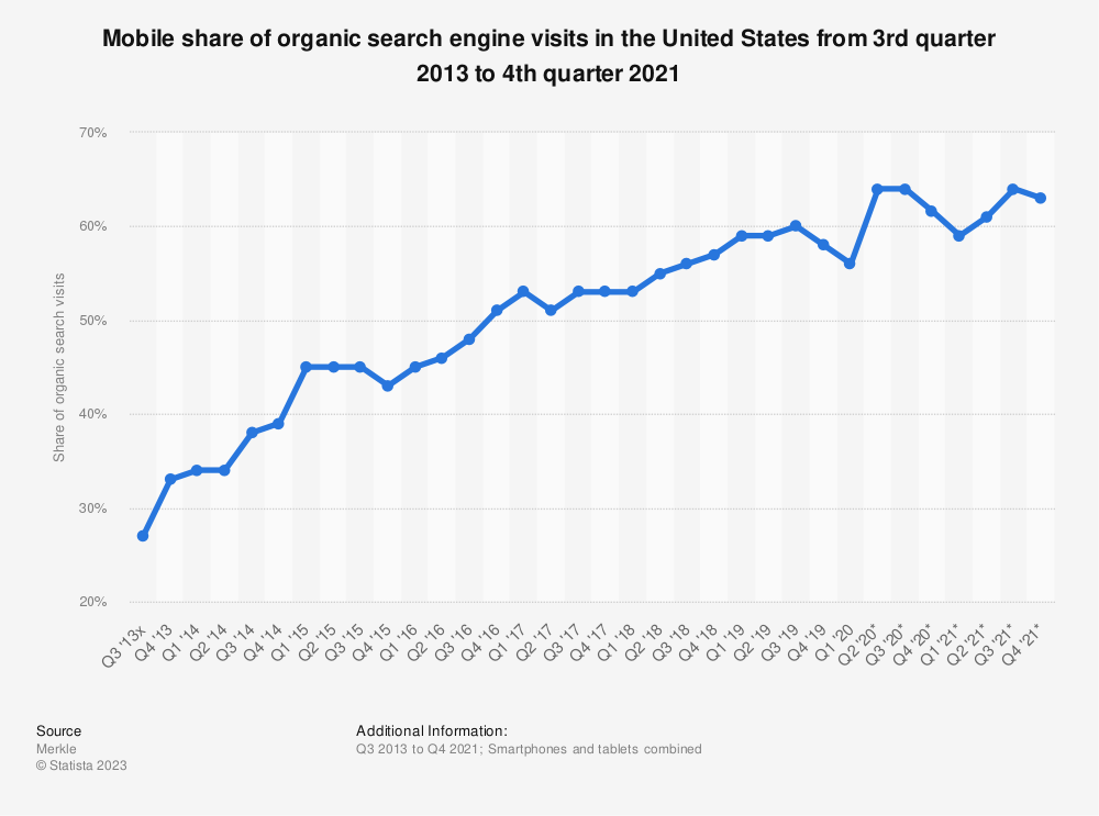
Over in the United Kingdom, Hitwise notes that mobile devices are responsible for 76% of online searches that lead to a health-related website.
So, it’s fair to say that a vast majority of potential clients will be using their smartphones or tablets to find and interact with your website, which means it’s absolutely vital that your site delivers a smooth, flawless user experience on any device or screen size.
If it doesn’t, users will quickly get frustrated and leave, meaning no leads.
With that in mind, you need to test how your site looks and functions on different devices, and then make any improvements if necessary.
I use my laptop to create content for my website and then load it on my iPhone for testing before it goes live, but you don’t need a whole bunch of phones and tablets to do this.
You can simply use your browser.
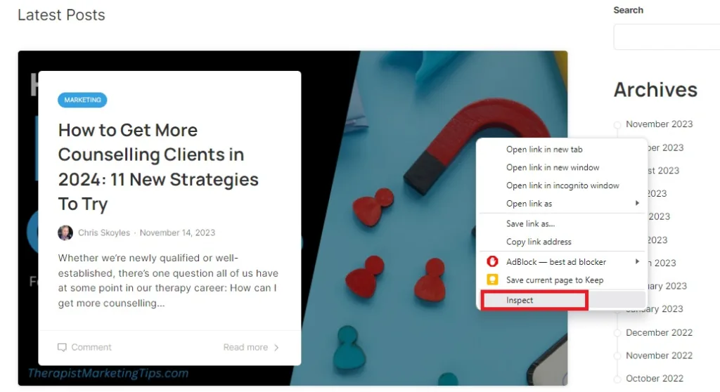
If you’re a Google Chrome user like me, open up your website, then right-click anywhere on the page and choose Inspect.

This will divide your browser tab in two, with your site on one side and its source code on the other.
If you’re unfamiliar with code, this probably looks like a whole bunch of scary gobbledygook.
Don’t panic, you don’t have to do anything with your code.
Instead, just tap the small icon to the left of the word Elements. If you look closely, you’ll see that this kind of looks like a smartphone placed in front of a computer screen. You’ll know you’ve got the right icon because, when you hover over it, it will say Toggle device toolbar.
Alternatively, you can achieve the exact same result by holding down Ctrl + Shift (Windows) or Command + Shift (Mac) and pressing the M key.
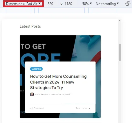
This allows you to interact with your website as though you’re on a different device. Here, I’m using my laptop but viewing my website as if it were on an iPad Air.
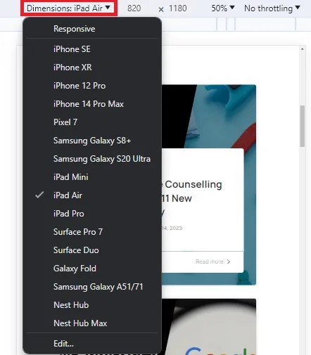
To test on a different device, simply click the drop-down menu and select it.
You can achieve the same result on the Firefox web browser.
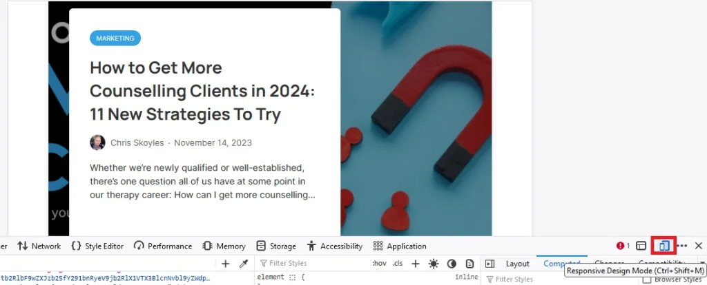
Here, the icon is down at the bottom-right, looks different from the one on Google Chrome, and is called Responsive Design Mode, but it does exactly the same thing.
Again, you can bypass this by holding Ctrl/Command + Shift + M.
Now that you’ve done this, here’s what to look for:
- Is the font size easy to read? If not, the text may be too small or too large. Adjust the font size to make reading on a mobile device comfortable.
- Are the interactive elements easy to tap? If not, the buttons, links, and other interactive elements may be too small or too close together. Make sure the interactive elements are large enough and spaced far enough apart to be easily tapped on a mobile device.
- Are the images and graphics optimized for mobile viewing? If not, they may be slow to load or not display correctly. Optimize the images and graphics for mobile viewing by using smaller file sizes and appropriate dimensions.
- Does the site work correctly in different orientations? Can users read your content, access your navigation menus, and use interactive elements in both portrait and landscape mode? If not, you may need to switch to a different website theme or design that does.
Bonus tip: You can test your site in both orientations on either Chrome or Google.

On Chrome, you’re looking for the icon called Rotate that looks like a phone surrounded by two arrows.

On Firefox, it’s called Rotate Viewport and looks like a smart device next to a single, down-facing arrow.
- Does the site load quickly? If not, users may get frustrated and abandon the site. Use a tool like Google PageSpeed Insights to test the site’s loading speed and identify any potential bottlenecks.
- Do your contact forms function correctly? If not, you’re not going to get any more therapy clients via those forms. Consider making the input areas and buttons bigger to accommodate people who are using them on their phone or tablet’s touch screen.
B. Add Contact Information to Your Header
Your website header is the section at the very top that typically contains your therapy practice logo and the main navigation menu.
This header is usually the same on every single page of your website, so using it to display your contact information means that potential clients will always know how to get in touch with you no matter which page of your website they’re on.
When your phone number and email address are prominently displayed on every page, users no longer have to go looking for it. This means it’s much easier for them to take immediate action, picking up the phone to book an appointment or sending an email for more information.
C. Make Your Telephone Number Clickable
Remember how I said most of your visitors are likely coming from mobile devices? Wouldn’t it be great if those visitors could use their smartphone to access your website then tap on your phone number and call you directly from your website?
Of course it would.
So, while you’re busy working on getting your contact information into your header, take a few extra moments to make your phone number clickable.
Here’s how easy this is to do:
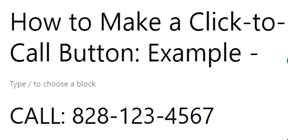
To begin, open up whatever platform you use to edit your website, and go to where you want to add your click-to-call button.
Write a simple Call to Action (CTA). It can be as simple as the one in this example, the word CALL followed by your phone number.
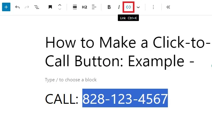
Next, select just the telephone number part of your text, and use your site’s editing tools to convert it into a hyperlink.
In this example, I’m using WordPress, but it doesn’t matter if you use a different tool.
The icon for adding a link is universal (it looks like a literal link of a chain), so you’ll be able to follow these instructions even if you’re using Wix, Squarespace, or something else entirely.

A box will appear where you would normally link to another page on your site or paste in the URL of a third-party webpage.
You’re not going to do that today.
Instead, write the letters tel followed by a colon (:), followed by your telephone number, as in:
tel:8281234567
Do not include any spaces or hyphens. If you do, this whole thing won’t work.

You’ll now see that your phone number is a hyperlink.
Now, publish your changes and then open up your site on a mobile device.
As you’ll see in the short video above, when you click on the link, your phone (and, thus, your visitors’ phones) will open up your phone number and allow you to call it directly.
D. Use Clear, Prominent Calls to Action (CTAs)
Your clickable phone number shouldn’t be the only Call to Action on your website. To maximize your chances of generating more leads, use strategically placed CTA buttons or links that encourage your visitors to take a specific action such as scheduling an appointment.
Ideally, your CTA should be one of the first things people see when they land on your homepage so that they know exactly what action you want them to take.
I’d also strongly encourage you to add them in a prominent position on your service pages and at the bottom of any blog posts.
To increase the effectiveness of your CTAs, make them:
- Clear and concise: Use simple, direct language that conveys the desired action.
- Visually appealing: Employ contrasting colors and prominent placements to make CTAs stand out and attract attention.
- Action-oriented: Use verbs which encourage immediate action, such as “Schedule Now,” “Contact Us.”
- Relevant to the content: Ensure that CTAs align with the surrounding content and provide a logical next step for the reader.
3. Boost Your Web Traffic
If you’ve followed all the steps above, you’ve now got a website that’s ready to start getting you more leads.
Before your site can do that job properly, it first needs a steady source of quality web traffic.
Here’s a few tips on how to get it.
A. Optimize Metadata For Your Existing Content
If you’ve already been creating content for your website, it may be that Google considers it good enough to be ranked in searched results but users aren’t being compelled to click on it.
This is something you can improve by optimizing metadata, particularly your page title and description.
First, it pays to identify those pages that could most benefit from this process.
To do that, it helps to have a free Google Search Console account to monitor your site’s performance in Google search results.
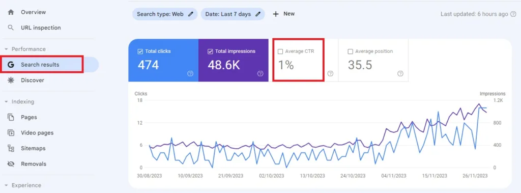
Once your account is set up, open Search console and navigate to Performance – Search Results.
By default, the Total Clicks and Total Impressions boxes are highlighted, but Average CTR isn’t.
So, click on that box to activate it and it will turn green.
CTR stands for Click-Through Rate. It’s a metric that measures the percentage of people who click on a specific search result for your website compared to the total number of impressions (times your website is seen in search results).

With your CTR figures turned on, scroll down and select Pages then tap on CTR to sort your indexed web pages by click-through rate.
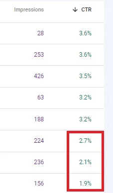
What you’re looking for here are those pages that have the lowest CTR. Backlinko notes that a CTR above 3% is pretty good, so look for any pages that fall below that.
In this example, I’d be going after these pages at the bottom that are under 3%.
Next, open those pages in your website editor and open up the metadata options. Where you find these options will depend on your website platform.
For example, as a WordPress user, I use the RankMath plugin which provides me with a convinient way to optimize my page titles and descriptions.
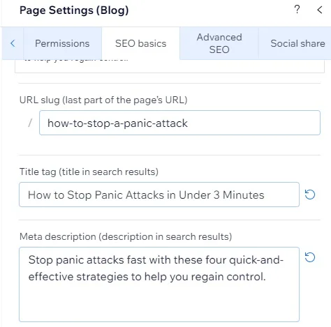
However, if you use Wix, you’ll find it under Page Settings – SEO Basics.
Now, to improve your click-through rate:
- Optimize Your Meta Titles – Craft clear, concise meta titles under 60 characters that accurately reflect your page content and naturally include your target keywords.
- Refine Your Meta Descriptions – Write compelling descriptions that accurately summarize the page content, highlight key benefits, and include your primary keyword. Keep your descriptions to under 160 to ensure they’re displayed properly in search results.
- Optimize Your Page Slug – Keep your page slugs (the part of the URL after your website’s domain name) under 60 characters. Ensure it accurately reflects the content of your page and includes your primary keyword.
The ultimate goal here is to create captivating page titles and descriptions that convince search users that all the answers they’re looking for are within your content. Do that, and you’ll get more clicks and more visitors.
B. Create Helpful Content and Resources
Once you’ve updated your underperforming content, it’s time to start working on new content.
I recommend reading my guide to creating helpful content to learn how to produce blogs that both users and search engines will love.
I also recommend that you learn about keyword research for therapists so that you can ensure that you’re creating content that aligns with the wants and needs of your audience.
By following the advice in the two guides I’ve just linked to and publishing valuable content, you’ll get your site listed in search results for a larger and more diverse set of search queries.
The more frequently you appear in relevant search results, the more chances you have to drive visitors to your site and, in turn, the more chances you have to convert visitors into therapy clients.
C. Invest in Paid Advertising
As the old saying goes, you sometimes have to spend money to make money, which is where paid advertising comes into play.
It’s typically said that PPC (Pay Per Click) advertising produces a return on investment of $2 for every $1, though Google estimates that for every $1 a business spends on their Google Ads, they generate $8 back in revenue.
Elsewhere, Facebook boasts 188,050,000 users in the United States alone, giving it the largest reach of any social media platform.
Both platforms have excellent, in-depth targeting options so that you can be sure you’re only spending money on ads that reach your exact target audience.
They also offer extensive tools to track your ad performance and analyze their effectiveness.
I’ll be putting together a comprehensive guide to PPC for therapists very soon. In the meantime, here’s a few tips to help you get started:
- Target your keywords: Focus on specific keywords relevant to your therapy services, location, and ideal client demographics for maximum impact.#
- Write compelling copy: Craft clear, concise, and benefit-driven ad copy with a unique value proposition that resonates with your audience.
- Utilize high-quality visuals: Use professional images and videos that capture attention and visually represent your practice and services.
- Test and fine-tune: Regularly test different ad variations, keywords, and targeting options to optimize performance and maximize your return on investment.
4. Convert Leads into Clients
Having done all that work to get more leads, there’s just one more hurdle to overcome:
Converting those leads into actual, paying therapy clients.
Although there are all kinds of reasons why someone may ultimately decide not to work with you after making initial contact, the following three tips will increase the chances that all the steps I’ve shared with you today will pay off.
A. Be Transparent About Your Pricing
You don’t need me to tell you that the relationship between you and your therapy clients is based on a solid foundation of trust.
Establishing that trust begins long before they take a seat in your therapy room. It begins right at the beginning your journey together, which in this case is when they land on your website to explore whether your service offer meets their needs
So, it pays to be open, honest and transparent about every aspect of your offer right from the very beginning, and that includes your pricing.
When you make your fees available on your website, you do a better job of managing client expectations from the start and further establish your credibility as an honest and trustworthy therapist.
You avoid visitors getting frustrated when they can’t find how much you charge, and deciding not to contact you because it seems like you have something to hide.
You avoid people assuming (perhaps falsely) that a lack of transparent pricing information means you charge more than they can afford and again, deciding not to contact you.
You also avoid wasting your time, and that of your clients, preventing situations where you speak to a potential client and they seem eager to work with you until they learn that there’s no way they can afford your fees.
This last point is particularly important.
After all, imagine someone saying the following to a friend or relative who is thinking about seeing a therapist:
“I was considering working with therapist Jane Smith. They looked like a great therapist, but I had to call to find out how much they charged and after all that, it was too expensive for me. It was so frustrating!”
Now, imagine them saying this instead:
”I was considering working with Jane Smith. They seemed great, but I saw their pricing on their website and unfortunately just too expensive for me right now. Still, I bet they’re worth it.”
You can obviously see for yourself which one is going to be better for your reputation.
B. Respond Promptly, Professionally, and Politely
Have you ever dealt with the frustration of waiting for someone to return an important call or email?
Have you ever had the feeling that someone you were speaking to on the phone didn’t have time for you or was distracted?
How about receiving an email reply that doesn’t answer all the questions you asked, meaning you have to start a game of email tennis to get all the information you need?
At best, it probably left you feeling undervalued, unappreciated or disrespected. At worst, it may have left you with all those feelings along with frustration and perhaps a modicum of disdain for the person in question.
Now, imagine having such an interaction (or lack thereof) while you’re also experiencing the kind of distress that leads people to seek out a therapist in the first place.
Would you want to entrust that person with your innermost troubles, let alone pay them for the privilege?
I certainly wouldn’t.
What I’m getting at here is that the timeliness and manner with which you respond to inquiries can easily be the deciding factor when it comes to landing a new client.
With that in mind, here are some specific action steps you can take to ensure your responses are timely, professional, and polite:
- Respond to inquiries within 24 hours. Even if you can’t provide a complete answer right away, acknowledge their message and let them know you’re working on it.
- Use professional language and tone. This doesn’t mean you have to be stuffy, but avoid using slang, typos, or overly casual language.
- Personalize your responses whenever possible. Use the client’s name and address their specific questions or concerns.
- Be helpful and informative. Go above and beyond to provide the information they need, even if it’s not directly related to your services.
C. Set up a Professional Voicemail
When unavailable to answer calls, ensure a professional voicemail message welcomes callers with warmth and courtesy.
Introduce yourself and your business, then advise callers on what information to leave in their message, such as their name, number, and the reason for their call. This simple yet informative message will leave a positive impression and encourage them to reconnect.
D. Manage and meet expectations
Other crucial details to include in your voicemail greeting are your operating hours and response time.
When a contact knows that you close at 7 PM, they’re less likely to call at 7.30 and wind up going to a different therapist because you didn’t pick up. When you tell people that you will respond within 24 hours from Monday to Friday, they have a clear idea of when they can expect to hear from you.
How To Get More Therapy Clients From Your Website: Key Takeaways and Next Steps
This guide is in no way an exhaustive list of all the different ways to get more therapy clients from your website, but it does provide you with an effective strategy for doing so:
Optimize your website for lead generation, then use a combination of SEO, content marketing, paid advertising, and other useful techniques to drive more visitors to your site.
The more visitors you drive to your site, and the more optimized that site is, the more therapy clients you’ll get from it.
This guide also taught you how to measure your traffic and lead-generation rates, which brings me to my final piece of advice:
Keep track of your data.
Use tools like Google Analytics and Google Search Console to measure the impact of your activities against the benchmarks you set in Step 1.
That way, you can identify what’s working and what isn’t so that you can fine-tune your strategy for optimum success.
Enjoyed this post? Get more marketing advice for therapists every week by following Therapist Marketing Tips on Facebook.


